45 Graphic Design Terms You Need to Know
Laura
13 December 2022What you will learn
- What is graphic design
- Graphic design terms
What Is Graphic Design?
Before learning new vocabulary, it’s important to briefly go over what graphic design actually is. The American Institute of Graphic Arts (AIGA) defines graphic design as “the art and practice of planning and projecting ideas and experiences with visual and textual content.” Graphic design expresses ideas or messages in a visual way. These visuals can be logos, websites, page layouts, images, etc.
If you are creating graphic designs, check out some basics to help you work better! Firstly, using the right tools to design the idea you want to communicate is essential. With the help of Canva or Creasquare, you will be able to develop your work in a fantastic way.
After selecting the graphic design tool of your liking, there are some specific terms that may help you understand graphic designs better and create some great designs of your own. If you want to communicate something, you must know how to do it correctly. Below, we’ve put together 45 graphic design terms that you need to know to become a great graphic designer.
45 Graphic Design Terms You Need To Know
1. Alignment
Alignment refers to how elements are arranged in a design, usually left, center or right. It is straightforward to notice when elements in a design are not aligned.
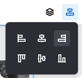
The Creative Studio allows you to easily and rapidly align elements in your designs.
2. Analogous Colors
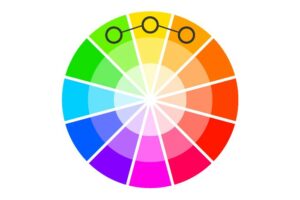
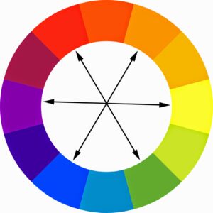
These are colors that are next to each other on the color wheel. Analogous colors match really well and create the right color harmony.
3. Body Copy
The body copy refers to the main text people will read on a design, and it is the paragraphs, sentences, or any type of text that appears in a publication.
4. Bowl
This is basically round or elliptical forms which are the body shape letters such as C, G, and O in the uppercase, and b, c, e, o, p in the lowercase.
5. Brand Identity
A brand is the essence of a company. To be able to show it to the public, you can create a visual version of your brand (brand identity), which can include a logo, slogan, website, packaging, and other marketing tools. For example, Mcdonald’s is well known due to its yellow logo and slogan, “I’m lovin’ it.”
6. Brandmark
A brandmark is a particular type of logo that uses a symbol instead of a company name.
7. Cap Height
The cap height is the height of the top of a capital letter, and it refers mainly to letters with a flat top, like H and I.
8. CMYK
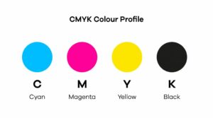
CMYK is a color model that is designed for printing purposes. The colors used are cyan, magenta, yellow, and key (black). CMYK creates color by adding color together: it makes images darker.
9. Cool Colors
These are blues, greens, and violets. They add a cooler look to the design by highlighting the blue tones. (Opposite of “Warm Colors”).
10. Complementary Colors
These are colors that are opposite to each other on the color wheel. For example: red and green or orange and blue.
11. Crop Marks/Trim Marks
Crop marks or trim marks are marks that specify to a printer where the paper should be trimmed. It is a handy tool that helps you communicate with printers much easier.
12. Display Type
Refers to large and prominent fonts designed to stand out and catch the viewer’s eye – for example, movie titles on posters or newspaper headlines.
13. Flat
This is the opposite of skeuomorphism. This flat design tends to be more minimal focusing on the space and two-dimensional images.
14. Foil
Foil is a process where a metallic or pigmented foil is applied to a surface (logos or business cards) through heat. The most common are gold foil and silver foil.
15. Golden Ratio
The Golden Ratio is a mathematical ratio: you take two objects and divide the larger by the smaller and get the result of 1.6180 (or near). It is used to make well-designed and attractive works.
16. Gradient
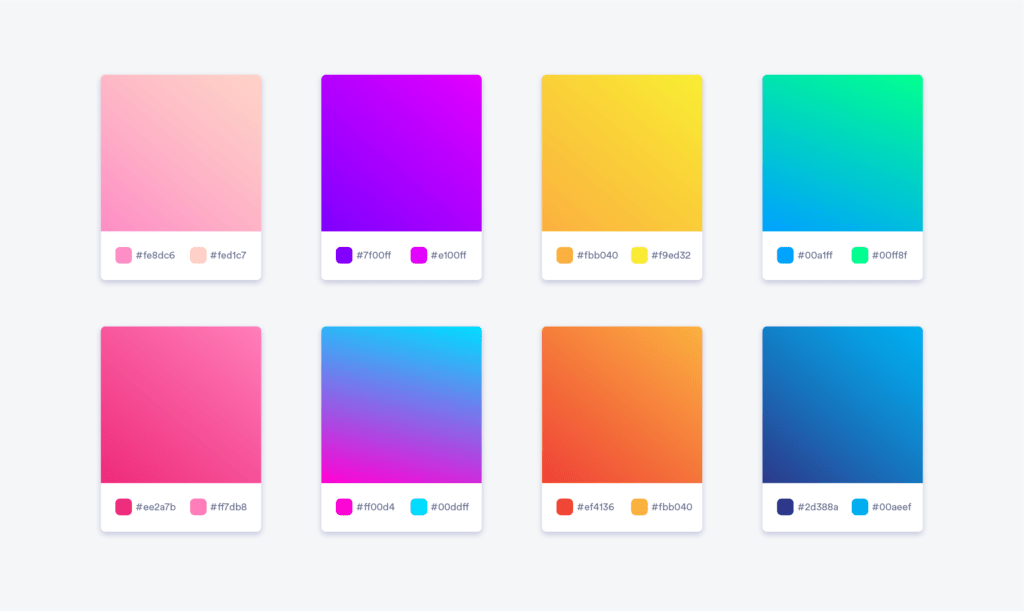
A gradient is a slight color change that starts in one tone and morphs into another. Another type of gradient is when you use a gradient that fades from one color into transparent, which is an effect often used on images and designs, as it overlays on them.
17. Grid
Graphic designers use a grid on their screens as a guide to ensure the elements are straight, balanced, and aligned correctly.
18. Hex
A hex is a six-digit number used in applications to represent colors.
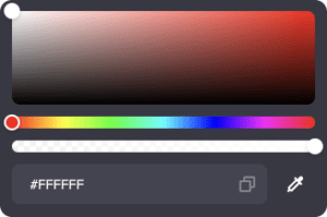
You can precisely define your colors with the Hex feature in the Creative Studio on Creasquare.
19. Icon
An icon is an image used to represent a particular object or action. As a graphic designer, you must think clearly about what your icon wants to mean so there is no confusion about it and your audience can easily understand it.
20. Kerning
Kerning is the spacing between two specific letters or characters. It can help with the legibility of a word or a sentence.
21. Leading
In contrast to kerning, leading is the spacing between two text baselines.
22. Logomark
The logo of a company does not always have the name of the brand. For example, the logomark of Twitter is the iconic bird.
You can add Logos to your designs for free with the Creative Studio on Creasquare.
23. Logotype
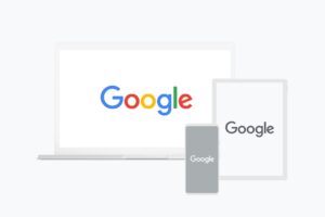
A logotype is a logo that uses only the brand’s name. Coca-Cola and Google are one of the most famous examples of logotypes.
24. Mock-up
This is a realistic representation of how your design will look.
25. Monochrome
Monochrome is a graphic design term for a color palette of many different shades and tones of one particular color.
26. Moodboard
Designers use a moodboard to organize their brainstorming and references (including images, videos, or typography) for a new project.
27. Palette
A color palette is a selection of colors for a design. These colors usually complement each other and create a beautiful design.
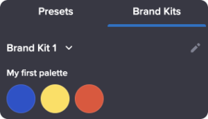
You can define your color palette within the Creative Studio on Creasquare.
28. Pantone (PMS)
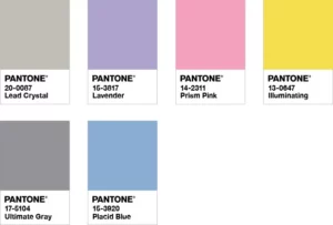
The Pantone Matching System is a standardized color-matching system. This system includes colors that cannot be mixed in CMYK.
29. Resolution
This term describes the sharpness and clarity of an image.
30. Rule of thirds
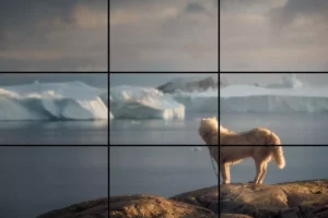
Use the rule of thirds to create balanced designs. It is usually used in photography: divide your image into three vertical columns and three horizontal columns to align the important elements of the picture.
31. Sand-Serif Typeface
This term refers to fonts that do not use serifs at the end of their letters. By using this, you make your fonts more modern and simple.
32. Scale
The scale refers to the relationship between an object’s size and another object’s size. You can use it to catch your viewer’s attention.
33. Script Typeface
This is a font based on modern or traditional handwriting styles. There are two forms of script fonts: formal and casual. The formal script is mainly based on seventeenth and eighteenth-century styles. But casual script fonts show a more creative hand.
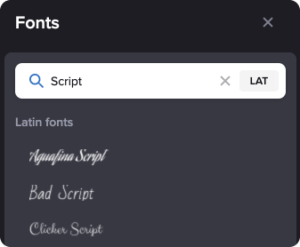
You have access to thousands of free fonts within the Creative Studio on Creasquare. Including many Script typefaces!
34. Serif Typeface
Unlike Sand-Serif typefaces, Serif typefaces have small decorative strokes (found at the end of each line in the letters). These types of fonts look fancy and professional.
35. Shortcuts
A shortcut is s particular key on your keyboard that allows you to do a specific function but in a short and easier process.
36. Skeuomorphism
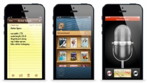
Skeuomorphism is when a digital design resembles a physical object. An example of a brand that uses this is Apple.
37. Style Guide
This is a guideline often used for branding as well as for color schemes, typefaces, and how logos are used.
38. Thumbnail Sketch
In the process of creating a design, designers tend to make small and rough drawings to brainstorm their ideas. This is called a thumbnail sketch.
39. Tracking
Tracking is similar, yet different, from kerning. It involves adjusting the spacing throughout an entire word. First, you use kerning to determine the right spacing between each letter, and then, you use tracking to change the spacing equally between every letter.
40. Triadic Colours
Triadic colors are three colors that are equally distributed around a color wheel. Usually, there is one dominant color and two secondary colors.
41. Typography
Typography refers to the style and appearance of printed words. Also, it refers to the art and process of printed or digital designs.
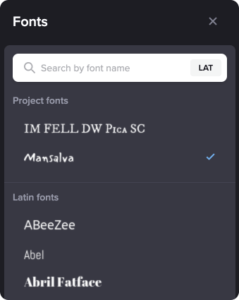
You have access to thousands of free fonts within the Creative Studio on Creasquare.
42. Warm Colors
Unlike cool colors, warm colors tend to be reds, oranges, and yellows.
43. White Space (or Negative Space)
Spaces in a design that aren’t filled with text or images are called white spaces (or negative spaces).
44. Widow
This is not what you think it is! In graphic design, widows are words or short sentences that are at the end of a paragraph but fall into the next page or column, separating from the rest of the text.
45. X-Height
X-Height refers to the height of lowercase letters. It is measured by comparing other letters with the height of the “x” in the font that is being used.
Conclusion
Not everyone has all the tools and materials to be a qualified graphic designer. But knowing some of the vocabulary is a good starting point. While it might be a bit tiring and confusing at first, you will soon realize that using these words will help you make more professional graphic designs as you analyze your work. Of course, you could find more new terms related to graphic design, and it would be fantastic to use them in your work, but in this list, you will find at least, the most popular terms designers tend to use. Commit them to memory and you will realize how frequently you use them.
We hope you find this list helpful, keep studying and feel free to share any questions or thoughts!
I encourage you to try out Creasquare to plan your posts and automate your process, it really makes a difference!
You should be all set for a great start. Check out our other articles here to discover more tips to grow your content creation business!

